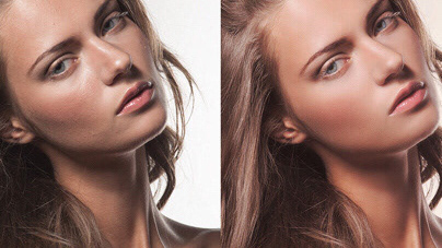

This is another cool piece created for the great design studio Sagmeister & Walsh, NYC. I was responsable for the post-production process which include photo retouching, compositing, color correction and grading. This one took around 20 hours of Photoshop work scattered over a couple of weeks.
Let me show you the whole creation process:
The sketch
The studio had a very clear idea of what they wanted from the beginning. They sent me a sketch mockup so I could get the direction they were going for. Then it was just a matter of gathering the right elements for the final composite.
The source material
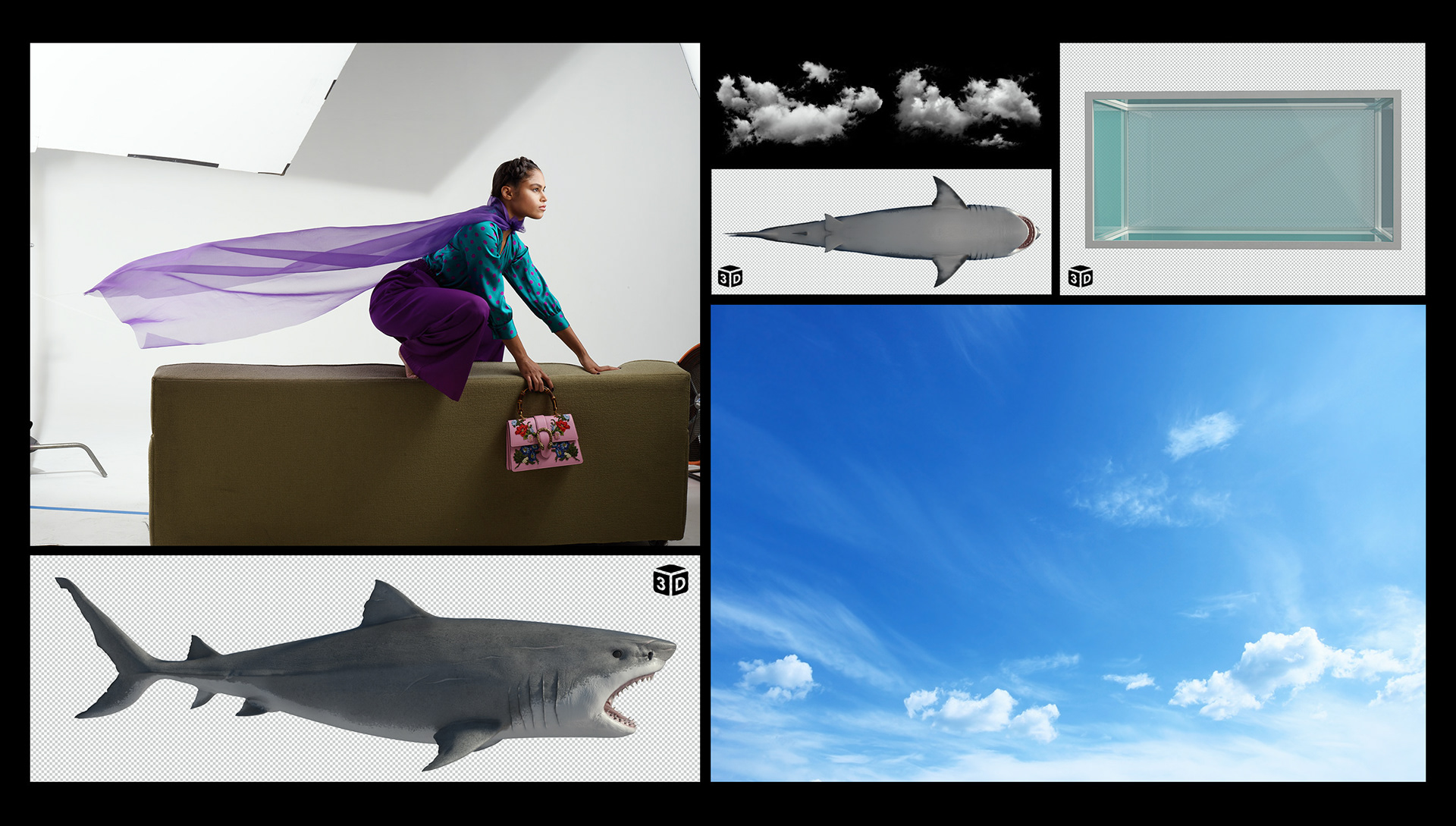
The required elements were pretty straight forward. We needed a sky background, an aquarium / tank, the shark and the girl who needed to be styled and photographed according to the sketch. A studio photoshoot took place and they sent me the selected frame of the girl pre-retouched and masked out.
The studio put me in contact with João Lucas, a very talented 3D Artist from Barcelona who created both the tank and the shark for this piece. He sent me high-res renders of them.
To complete the materials I pick a few stock photos of clouds and a sky with the main light source coming from the right in order to match the photoshoot. Same instruction was given to João so all the elements were consistent.
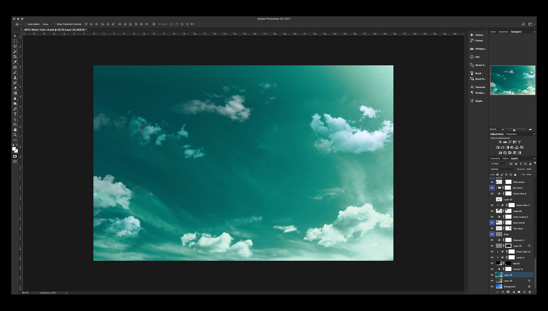
The background
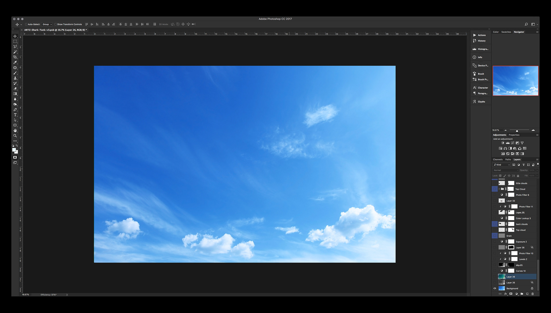
I started with the stock photo of the sky but it needed to be cleaner and also in a different color so it would resemble the sketch. Also it needed to hace smaller clouds surrounding the main subject. So that´s exactly what I did.
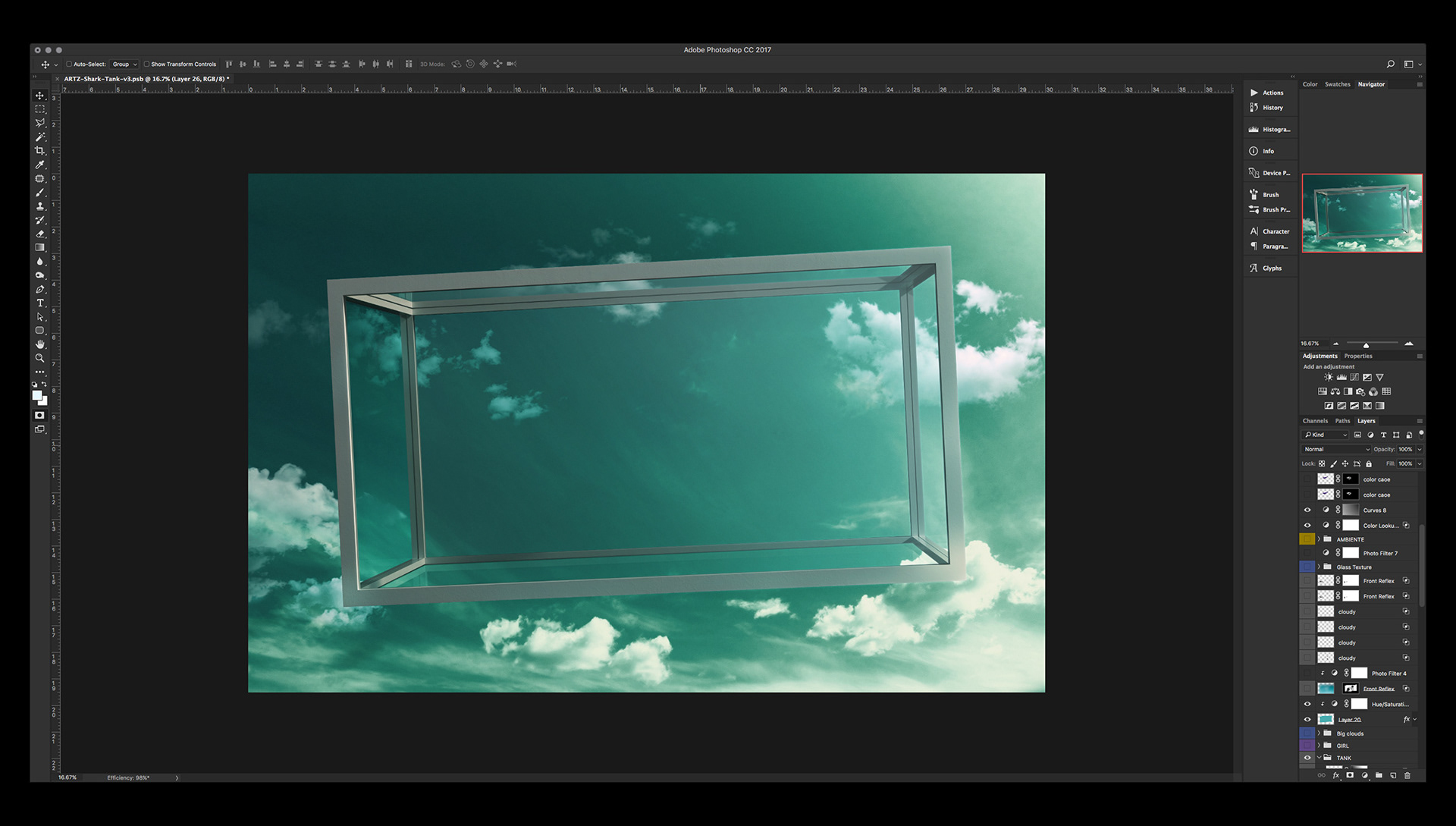
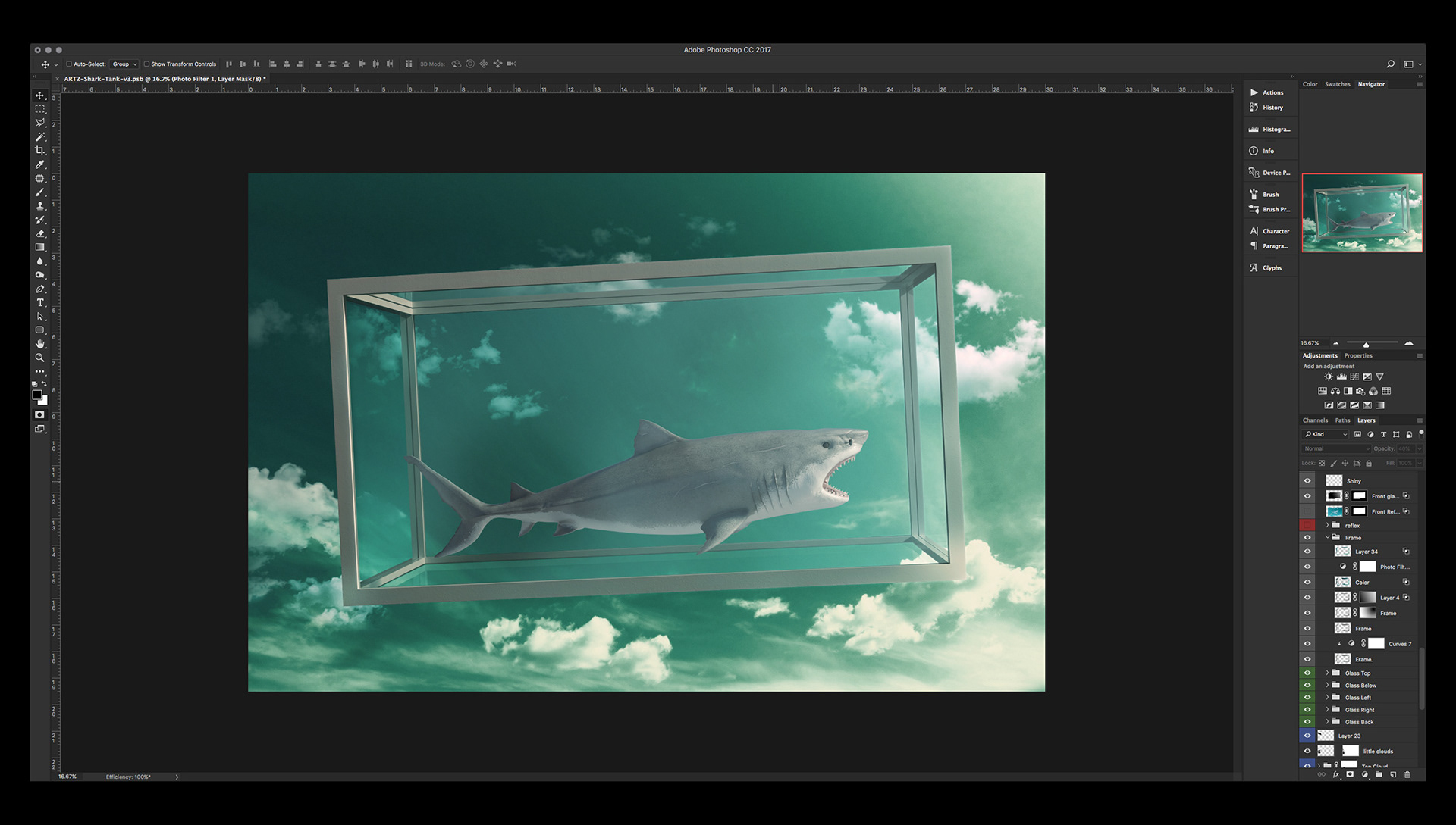
Then I added the tank but I cut out all the glass panels from it. I needed to work with them separately so I could control the way it affects what’s inside the tank.
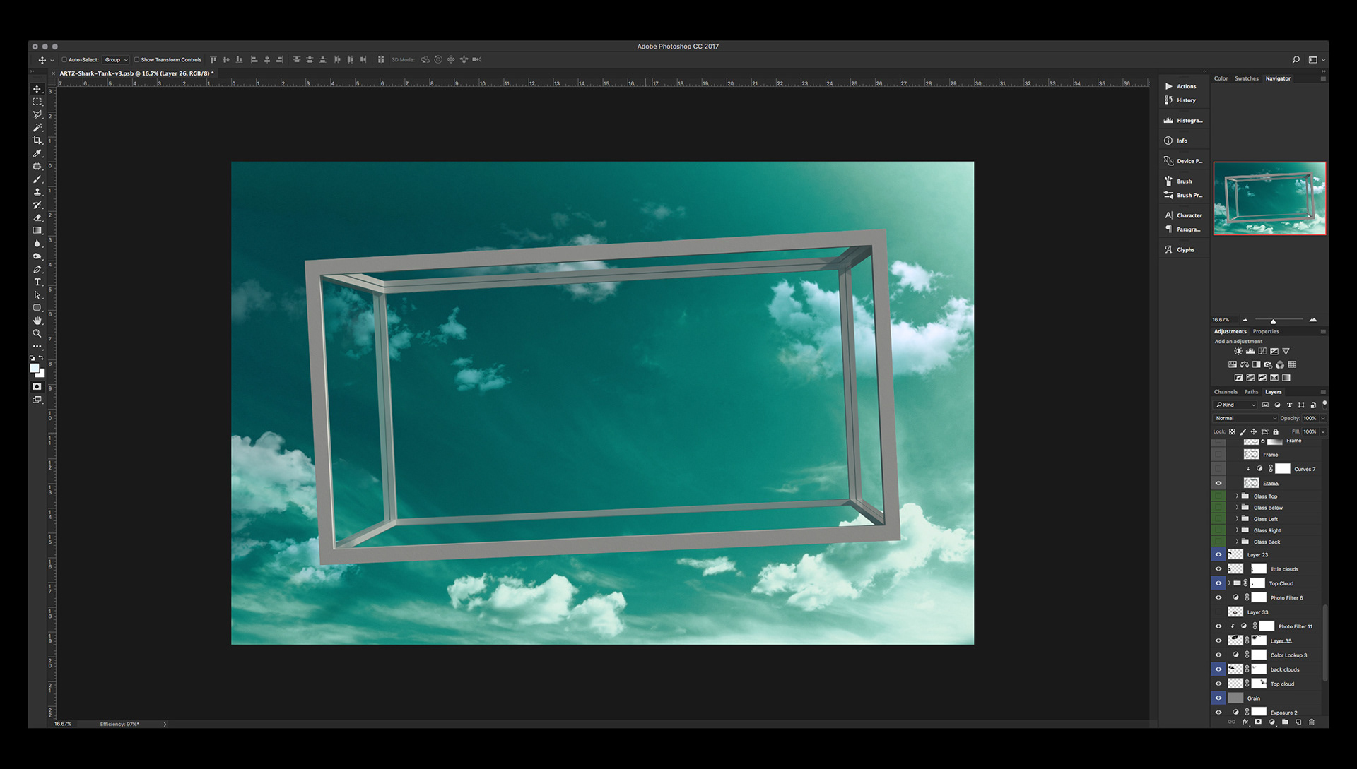
Consistent lighting
I worked on the consistency of the light and how the main light source affects the tank, tha glass and its reflections. To that end I accentuated the main light source coming from the top right corner. Composition wise all this needed to be done before adding the girl and the shark because all this would affect them.
Making tweaks
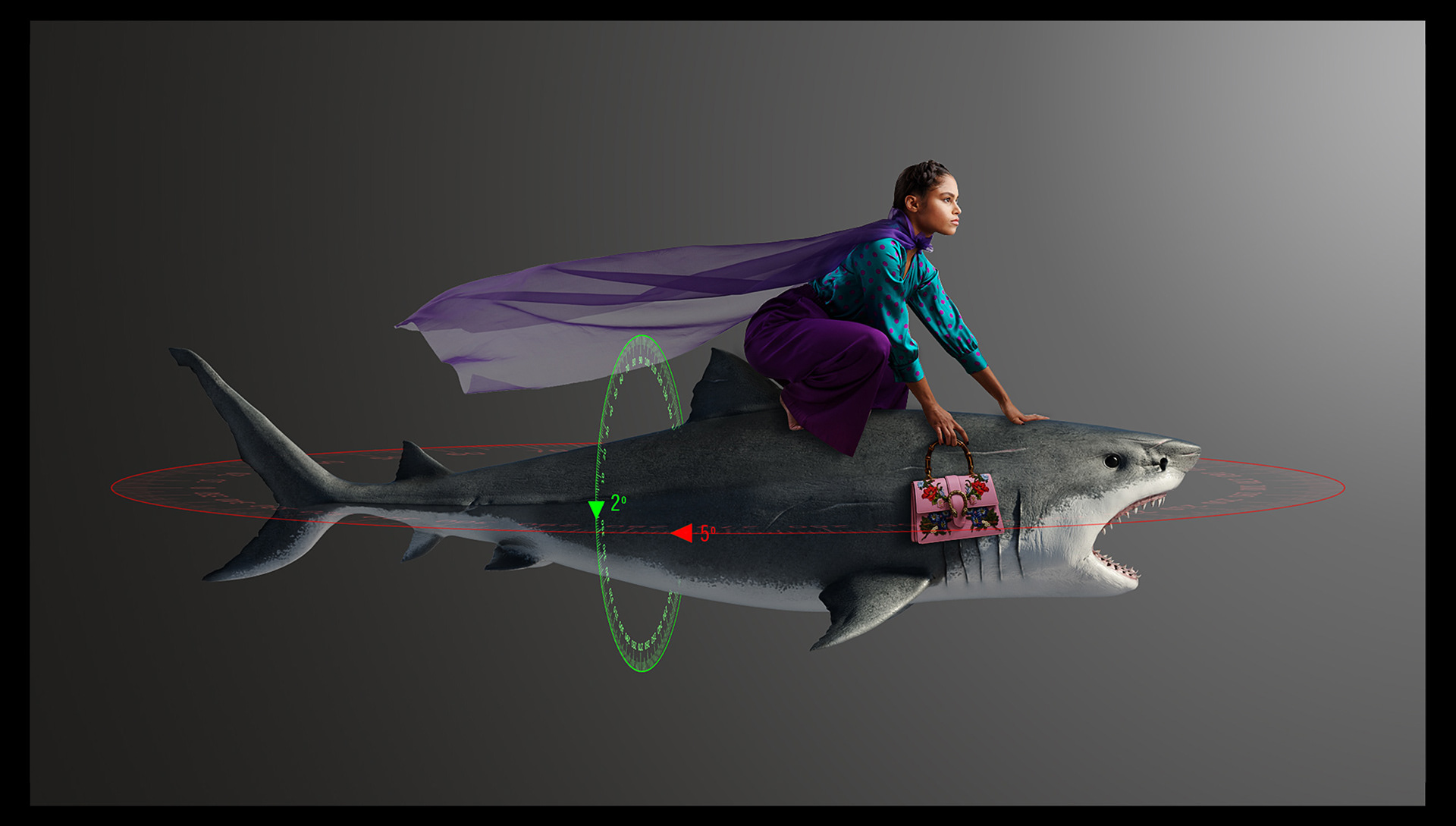
The original render of the shark was in perfect profile. I made a low-res composite in oder to test the position of the girl on top of it.
I tought it would look better if the shark was slightly tilted. So I sent this image to João marking the adjustments so he could make the rotation changes and send me a new render that would fit a little better.
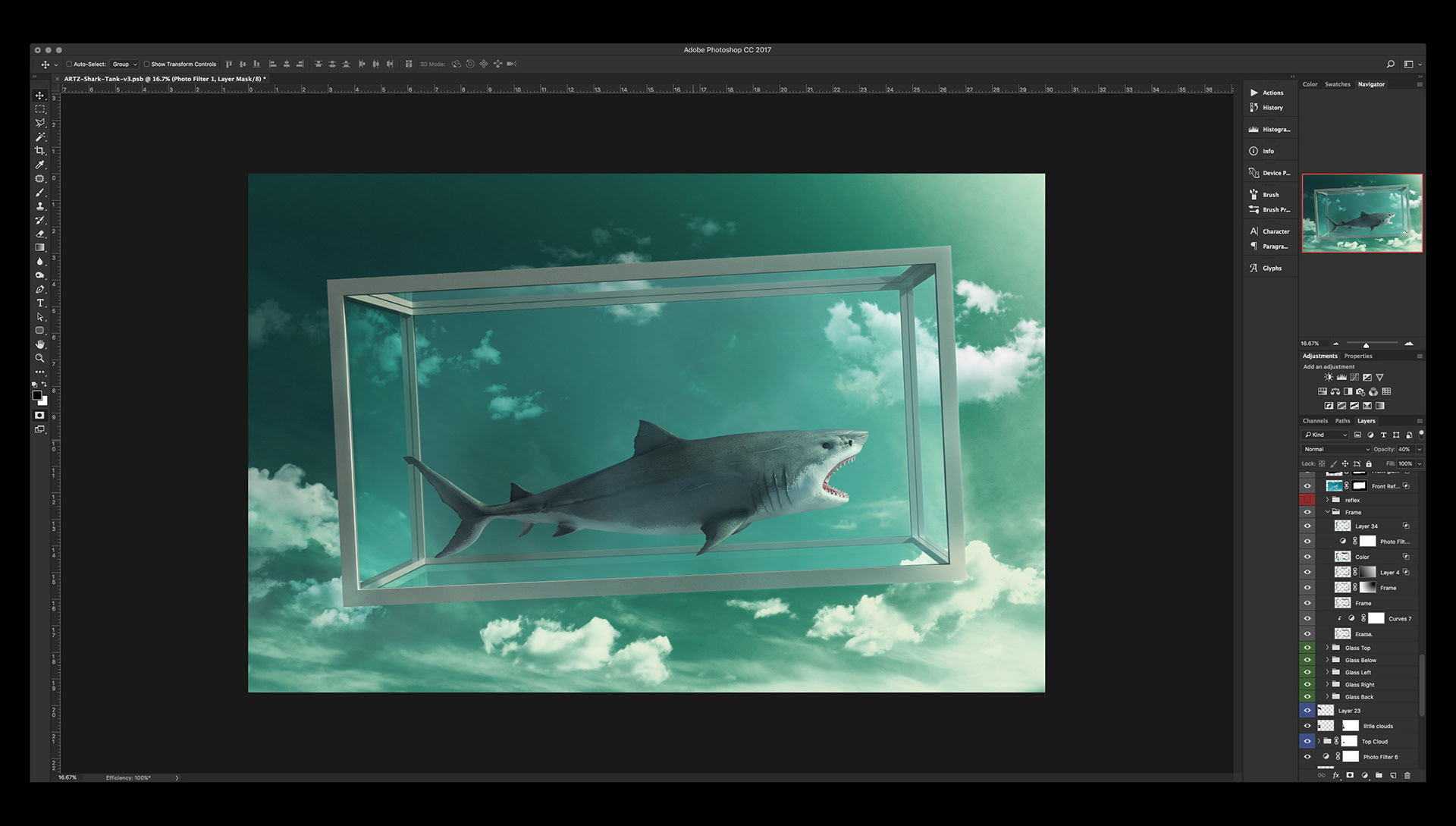
With the new render of the shark now I was able to place it within the tank and recalibrate the lighting so the shadows were coherent in both color and intensity with the main light source.
Since the tank is made out of glass, reflections are unavoidable. This means I needed a new render of the shark from below to be placed in the bottom glass panel of the tank. I asked João for it and he kindly sent it to me right away.
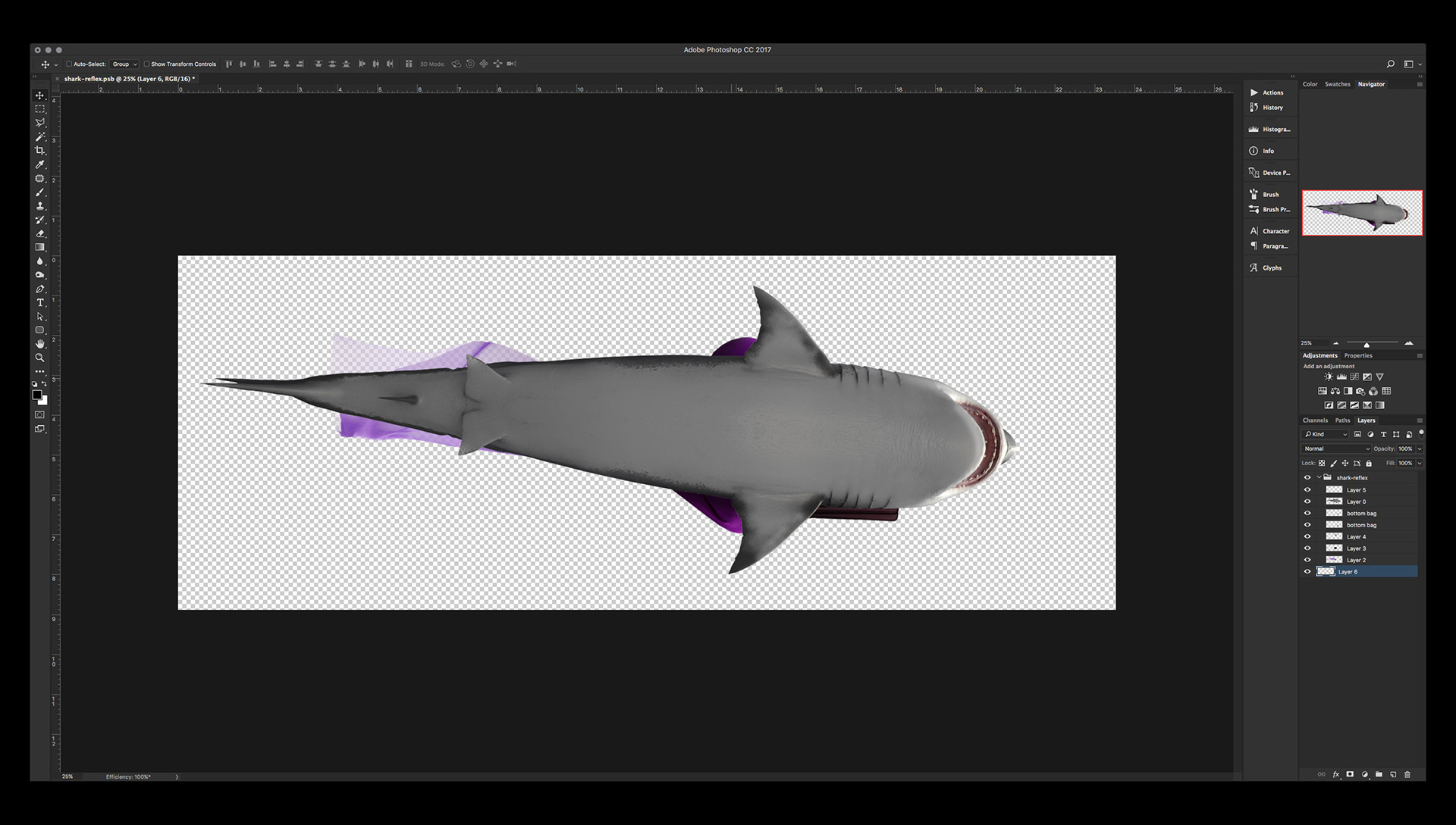
Even though this is just a reflection and people usually don’t pay that much attention to those details, the render of the shark by itself wasn't enough.
According to the studio picture of the girl there are some elements that are suppose to be there and I have to include them such as: the reference of the girl's legs sticking out both sides of the shark, her purse hanging on the side and her scarf floating in the air towards the shark’s tail.
According to the studio picture of the girl there are some elements that are suppose to be there and I have to include them such as: the reference of the girl's legs sticking out both sides of the shark, her purse hanging on the side and her scarf floating in the air towards the shark’s tail.

Once both the shark and its reflection were taken care of it was time to add the girl.
The studio sent the image pre retouched and masked which was helpful. But they wanted to re shape the model’s hair to look more puffy and move the hairline a little towards the front so her forehead was less prominent. So I did that, no big deal.
I also re shaped the scarf so it had more movement and looked a little less stiff compared to the original.
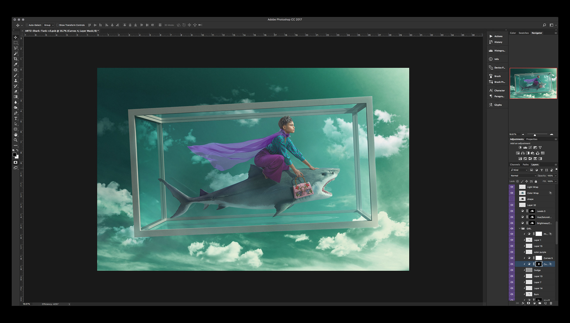
Then I just needed to recreate her shadows on top of the shark and regulate the amount of transparency the scarf had. A the same time I created the reflection of the shark and the girl on the back glass panel.
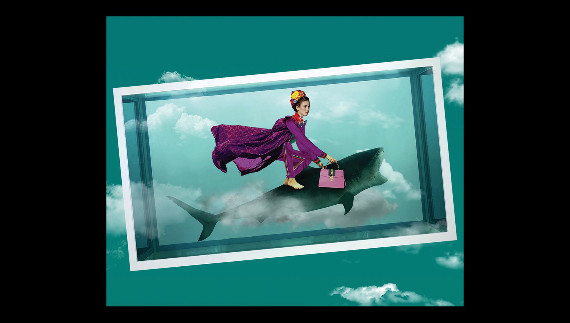
Now the composition is almost ready. Just needed the final color grading to make everything pop.
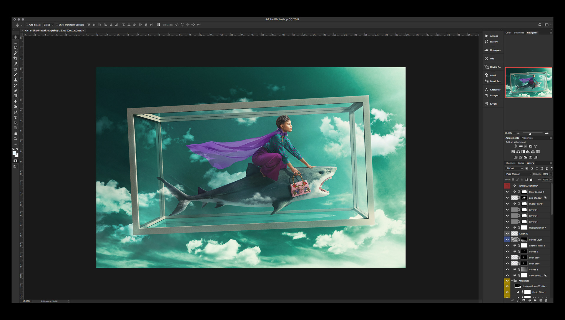
Final color correction
There wasn’t a big shift in color. What the image needed was a little more intensity of the light which will in turn affect the intensity of the colors in general. Before color correction the image looked rather flat. The intention bahind this last step is to add depth and volume to the elements.
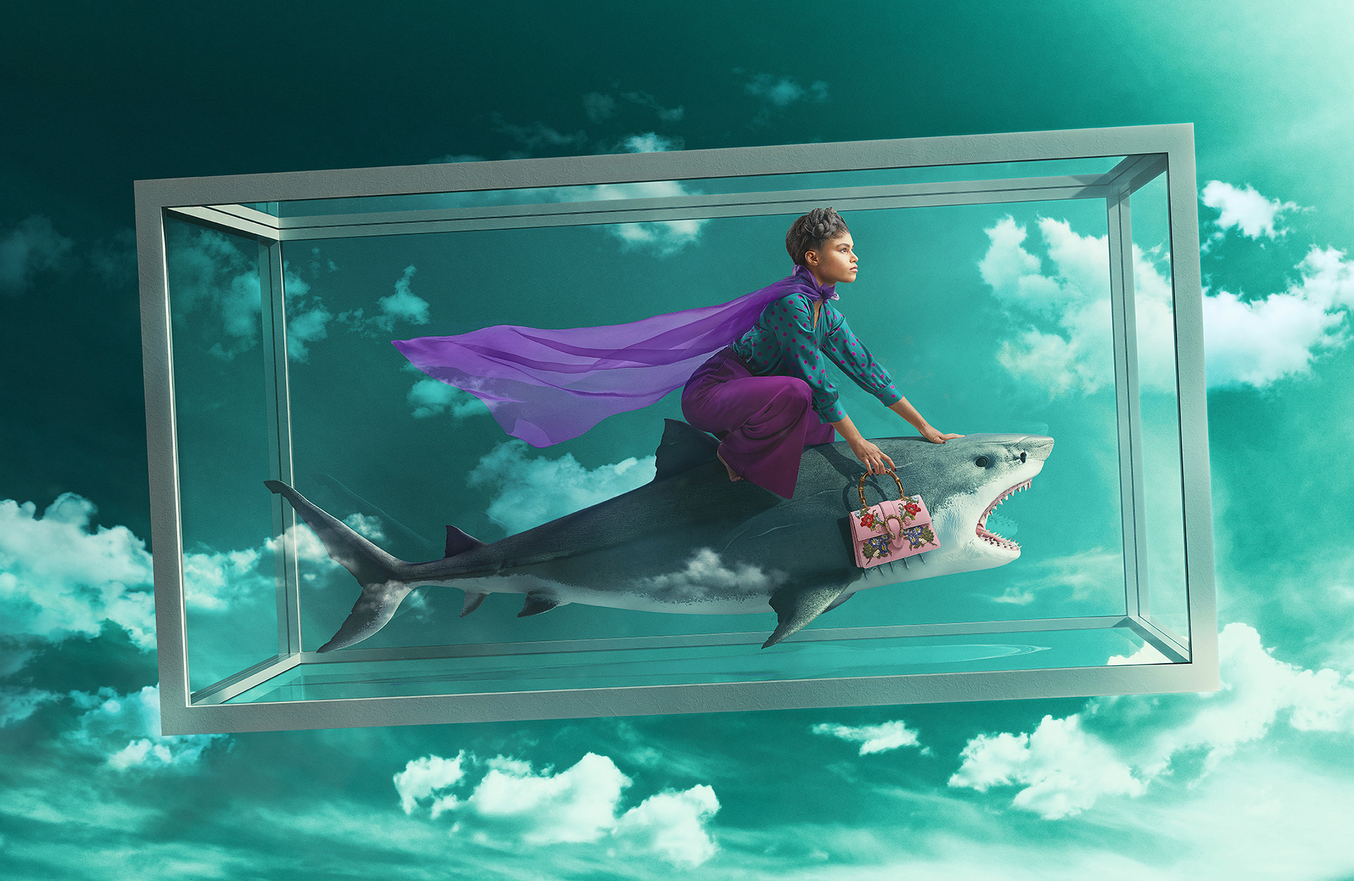
So that’s it. It was a very cool, very colaborative project to be involved with. I think it looks great. The studio thought so too. I'm very happy with the result.
THANK YOU FOR CHECKING OUT THE PROCESS!
CREDITS:
Concept: Sagmeister & Walsh, NYC
Art Direction: Jessica Walsh
Producer: Erica Grubman
Retouch & Composite: Carlos Jiménez
3D Artist: João Lucas
Photoshoot: Sagmeister & Walsh, NYC
Stock Photography: ShutterStock